Wednesday 2 May 2012

Reflections of Painting 3 Final Project-PAINT


I would like to make some kind of review about my experience on the Level 3 Advanced painting course. I think a small series of notes tackling one aspect that has been meaningful or significant would be the best way to tackle this.

In this series of painting I decided to use oil paint, a medium I had used in the past but had been exploring acrylic lately. I had forgotten how much I liked the smell and feel of oils, and I do think they have a richer quality than acrylic. Of course they take longer to dry and I am a bit clumsy so tend to get paint on my clothes.......

I chose oil for this series because I felt I could use a bit of a 'lift' and the subconscious feeling that oil is 'proper' painting (this seems a bit silly, especially as I stick everything bar the kitchen sink on my work).

I really enjoyed using the oils, having more time to manipulate the paint helped me to relax into the painting, to enjoy the feel of spreading/applying the paint and to enjoy the medium on quite a physical level. I think these experiences have translated into my work which is looser and more intuitive than previously. I think this has allowed the work to be more personal. A good move!

I also chose to invest in some artists quality paints. These really make the job easier. With these paints there is more pigment which makes the colours richer and more intense. I had previously resorted to inserting spots of oil pastel colour in my work to get a really intense colour but with a better quality of paint this wasn't necessary.

I had treated myself to some new brushes, including some that were larger than I had been used to using. When I was working on larger canvases I decided to use these larger brushes. I felt that this would help maintain some of the integrity of the sketches that I was trying to scale up. With a larger brush I was more confident in applying larger areas of solid colour. I really like the impact that these areas brought to the painting and used them even in some smaller work.


Tuesday 1 May 2012

Learning Log - Holy Land of the English-


Holy Land of the English

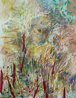
I decided to call this painting Holy Land of the English as this is another name for the Fens, derived from the unusually large number of cathedrals, abbeys and churches in the Fenland. I like the link with old English hymns such as Jerusalem and thoughts of crusaders. It is also a homage to the patriotism of the English (pink and white!) and a celebration of rural life. I think there are elements of the stained glass similarities with windows in the painting, the leadwork and the bright colours of the glass.

My final painting began life as 'A Bit Creepy',  a study I had done earlier but wasn't very happy with. However, when I was looking through my sketch book -as I often do throughout a project- I realised that I really liked a small part of the study at the bottom left, and decided to base this painting on that. I felt that this area had all the vigour,form and excitement of the Fens really up close.


I was enthusiastic about the idea of doing something very colourful and abstract. I felt this would demonstrate the joy of planting and growing, regeneration. After all spring has now arrived! This painting is really a celebration of what man and nature have achieved together.

Beneath the paint there are photocopies of a drawing of Lowin, an athletic young man scrambling onto the climbing frame. You can just see him in the middle right hand side of the painting. There are the intersecting lines of thread resembling railway and road and the long ditches that intersect the fields. There are the regular rectangular shapes of the fields and the printed stripes of the furrows.

To represent the interlocking blades of grass I cut up strips of paper with satellite images of the area. Small towns and villages like Sawtry, Yaxley and Ramesy and the old roman Eye Road are there to be found on close inspection.

It was quite a challenge to take such a small area and enlarge it so much. I was worried that the painting would not have much depth and that it would be impossible to replicate the textures and tones. The sketch is a watercolour, my final painting uses oils. I think I have been able to keep the basic composition fairly true, but have taken a liberty with the colour, making it bolder and brighter.

I was anxious to still keep the painting quite edgy and decided to introduce the Pebeo black sand in a more structured way. I masked off some areas then applied the sand, when this was dry I put a warm burnt sienna wash over it. I was pleased with the result of this. I think the sharp lines work well with the organic nature of the sand and bring an industrial feel to the painting.

I have printed some narrow black stripes on the canvas which I really like. They echo the rhythm and composition of the painting and a kind of 'order' to the 'chaos'. I like the fact that you can see through them and this brings a sense of depth, a feeling that something is beyond what we initially see.

A lot of fancy' papers have been used in the collage, including some shiny metallic and old gold paper. Normally I would avoid these, but I think the metallic glint is an appropriate reference: firstly to the industrial elements of the landscape and also as a nod to religious iconography.


I


Saturday 28 April 2012

Final Project-Jenna and 6,000 miles of Embankment


Jenna and 600 miles of Embankment


This painting began as a montage of photocopies of Jenna hanging from the climbing frame. Her enthusiasm and joy were infectious and I had to use them somewhere in my work. I like the idea of introducing people from other cultures into a commentary of the Fens as our main city, Peterborough, is heavily populated with people from Eastern Europe, Russia, Portugal, India, Pakistan and South America. Jenna is a symbol of the youthfulness of our population and the hope they bring for the future of the Fens.


I liked the vortex of limbs and hoped to keep the sinuous, softer shapes in this work, which reminded me of the interlacing of grasses in the photos I had taken earlier and used in Four Thousand Farms. Some of my colleagues wondered why I would go to the bother of creating a montage and then cover it up and paint over it. To include the montage seemed important to me. Just knowing that she was part of the painting (and you can still see her!) creates something more powerful and interesting. The landscape become more of a commentary than simply a pretty picture. We all play a part in the picture of our communities, but most of the time we are little noticed except by those we are closest to. For me Jenna plays an important part of the development of this painting. I notice her, and hope that when people take time to really examine the painting that they will notice her too, and the important part she plays.

I felt that using small oil pastels had been successful in my earlier work and was attracted by the colours in this small sketch and decided to use it as a spring board for my painting.


As with my previous work I wanted to reference other aspects of the Fens with textures and divisions and that is how I began. In this painting I felt that I would like a more direct contact with the land and added soil and chaff and some seed heads that I had gathered whilst out sketching. I attached these with glue and later painted over them. They become immersed in the painting rather than be a stand out/ stand alone reference. In the bottom right corner there is also part of some sketch book studies for field patterns.
It took me a while to get the composition laid out in a satisfactory way and it has changed from the original but I think that looking at the painting and what works in the final piece is more important to me than slavishly repeating the study.
My horizon has again become more industrial and the 'fencing/gates' on the right continue the comment of battle between man and nature. I think the horizontal lines that run across the painting balance the strong verticals. they seem to embrace the painting and quietly hold it together.

Having recently seen the Hockney exhibition at the RA I can sense his influence in using brighter colours and simple more stylised forms, although my painting is significantly different from his there is another worldliness about them!


Friday 27 April 2012

Final Project-Learning Log, Four Thousand Farms


Four Thousand Farms


 In my study for this project I did some research into the creation/history/geography and general demographics of the fens. This painting represents the chaos at the edge of a field, nature; the cultivated field is just visible at the top of the painting with fresh uniform growth, and of course the four thousand farms that the Fens support.


FTF began with photocopies of a picture I had taken of the land protected from frosts with straw. This gave me a structure to start from and I love the apparently random interlacing of the stems which would later be reintroduced to the surface of the painting. Some of the photocopies are still visible.Once more I chose to introduce lots of texture onto the surface. This helps create depth and surface interest, but the long straight lines of the thread are reminiscent of the way the land is divided with fields, roads, railways and drainage ditches. I like the contrast between the formal structure underlying the painting and the organic application of the paint, a hard line meets a soft line. I also used some Pebeo black  nature gel for an earthy effect.


 I was attracted by the vibrant colours and energy in a small oil pastel sketch I had made of the rough grass at the edge of a field. I was attracted by the contrast of rough and smooth texture, and the contrasting colours, cool green and the fiery orange and reds. I choose to zoom in on the rough texture of the foreground as it made a more dynamic painting. I was excited to be working with a much more exuberant palette than usual.
I have found in this set of paintings that I often need to work with a larger bush, creating more blocks of solid colour. In the past I may have used more 'bitty' arrangements of colour to guide your eye around a painting. Working from very simple sketches directly to the canvas has
been a useful experiment and helped me to be bolder in my use and application of colour.
Adding the strips of paper at the end was to reintroduce structure to the painting. I like the way they thrust themselves across the canvas, providing a lot of energy and movement despite their  geometric, regular shapes. Some of these shapes have been outlined a la Hockney and Van Gogh!
Four Thousand Farms is written along some of the strips.

Final Project-Learning Log 2 - Hold On


Hold On

Hold On began as a montage of photocopies of a painting I had done in the summer of two children on a slide. I loved the tenderness of this painting and an idea for a series based on the theme of 'holding on' began to formulate for  my figurative work - remember Agnieska was struggling to pull herself onto the climbing frame. I felt that the reference was appropriate to the Fen landscape where our hold is tenuous  and a constant struggle against the forces of nature. If we let go the land will be lost to the forces of nature.


I added structure and texture to the canvas with thread, fabrics and papers referencing the patterns of fields from an arial perspective. I then added oil paint with a pallete knife in block colours using a section of a small oil pastel as inspiration. Small photos of individuals living in the area have been snipped from the local paper and attached to the canvas. These images, and the many figurative elements and forms within the painting, provide a subtle texture and allude to the relationship of man and land in the Fens. I have used some printing  and have worked some soft pencil through the paint for other  effects.


Read more »

Tuesday 24 April 2012

Final Project - Learning Log 2


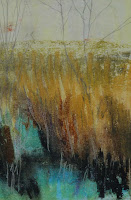
My series began with a small oil painting, Out of Focus.It was really a bit of fun, a little release before the serious work of my final project. In reality I learnt that everything that I had been looking at had been simmering away, waiting for an unselfconscious moment. The painting really just 'came out'.

I referred back to some of the research/sketchbook work from the 'scattered images' project in the 'Your Own portfolio" course. I had been intrigued by randomness and  control, so I started scattering and glueing small strips of paper over the surface of the canvas. This felt like the random pattern of harvested crops or of the grass verges of the fields and created a lively texture. I then decided to paint in a very loose way with a pallet knife over the surface. I began covering everything with black, then simply worked in a horizon and a field.

Since a  recent visit to the Gerhard Richter exhibition I have been interested in the colour and qualities of grey. I have been doing a lot of research into black, but hadn't really considered how important grey could be in your pallete. In this painting I felt inspired to use small negative shapes in grey to bring definition and rhythm. Using grey made the other colours seem to have more importance. Grey is softer, more subtle than black; more subdued, less intrusive or attention seeking than white. I t seems a perfect foil for any colour. I like the way the small grey shapes tend to disappear or recede beyond the fabric of the painting.

In the centre of the painting is a smudge, an area our of focus. This began as an area that I was not quite happy with until I realised that the blurred area helped the eye to work it's way around the painting. I think there a many analogies/comments one could make here about how we 'look' at the landscape and what we value or 'see' there.

The horizon has a slight industrial feel, a reference to the meeting of nature and manufacture which typifies the fens as much as it's flat fields and big skies.


My next work, In the Groove, began as a patchwork of fields using different paper and textures. I was trying to work in a figure of a child hanging onto a pole but was frustrated with the way things were going. It all seemed too direct and contrived. I had so enjoyed the freedom with which I had painted Out Of Focus, that I decided to try to be freer and more spontaneous in my work. I referred back to some of my sketches and decided to focus in on a small area of a little oil pastel of a drain at Oxburgh. I again added some snips of paper and this time included some sand for texture.

Although the original image is almost totally obscured (I can just make out a hand and face in the top right  of the painting, and a foot on the top left) It doesn't seem so important. When you look at the painting you will begin to see figures in the shadows. This is how I would like the influence of mankind to be expressed in these paintings, kind of 'behind the scenes'. In reality nature is the dominant feature in the Fen landscape. Man only manipulates it, a kind of puppet master, we see the Work but not the Master.


My third painting, Agneiska,was a rework of a painting I had begun in the summer, of the children at school. When I decided to change the topic of my project the painting was abandoned. Since I had begun to think about incorporating figures in a submerged type of way it seemed appropriate to resurrect the painting. Agneiska is submerged by the landscape, only her face, with an expression of determination and struggle remain( she was trying to pull herself up onto a climbing frame). The tension and struggle is still expressed in the painting via the strong diagonals, and strong contrasts in colour.


I had taken photographs of the land, literally. I held my camera parallel to the ground, zoomed in and snapped away. It was interesting to see the relationship between the arial photos and these zoomed in photos - lots of intersecting!

I decided to use one of these photos as the basis for this painting. I used my scattered strips again, then built up the form. Firstly with a pallete knife and then with a brush. I have also used a pencil. There is a very fluid feel to this painting. The Fens are generally quite damp underfoot. The grasses are like a wave traversing the canvas. The textures expressing the soil on the top left appear like a flock of birds taking flight, while on the right the grass strips are like an army of cranes, or search lights from a prison. Once more there are shadowy figures to be found alluding to man's role in the landscape.




Friday 30 March 2012

David Hockney - The Bigger Picture

Well this was pretty interesting. Some good fortune came my way to allow me to see Hockney's Yorkshire vistas , and big they certainly were. This exhibition was exciting for an artist who is exploring her own local landscape. I loved the drama and enthusiasm for the dales which was evident everywhere.

The arrival of spring, viewed from the first gallery is a an image created from 32 canvases. I was captured by the stylised motifs, the way colour is used to make images recede and advance, that complimentary colours are used to outline important elements. These techniques are used throughout the work.


Hockney is a master of mark making - even with what might be considered fairly crude electronic tools. The colours are used with boldness and confidence. Think alizarin red, magenta, violet, burnt sienna, and naples yellow; creating the ploughed field in the Thirkendale Trees. These colours are laid on with bold strikes, splodges, and blobs that gently recede into the distance. Paint can be laid on thickly and then scaled back (or not) or can be applied thinly in washes allowing the canvas to show through, and this can all be in the same painting.


I loved the sensitive charcols and the idea of looking at the continuing 'life after death' of the trees. I thought this  was his most successful work. Simpler forms and stylised colour with exciting mark making. These painting, evocative of a sinister Disney world, are surreal and absorbing. They are more intense and provocative, creating questions about mortality and our purpose and place in life.


 After the exhibition I took a wander round the National Gallery, well some bits of! I was struck by Van Gogh's painting of his chair. This beautiful painting included some of the same techniques of Hockney, namely a lot of viridian, impasto paint to describe texture and outlining form with complementary colour. The scale is completely different, the subject matter -still wood! Utterly beautiful!