Friday 30 March 2012

David Hockney - The Bigger Picture

Well this was pretty interesting. Some good fortune came my way to allow me to see Hockney's Yorkshire vistas , and big they certainly were. This exhibition was exciting for an artist who is exploring her own local landscape. I loved the drama and enthusiasm for the dales which was evident everywhere.

The arrival of spring, viewed from the first gallery is a an image created from 32 canvases. I was captured by the stylised motifs, the way colour is used to make images recede and advance, that complimentary colours are used to outline important elements. These techniques are used throughout the work.


Hockney is a master of mark making - even with what might be considered fairly crude electronic tools. The colours are used with boldness and confidence. Think alizarin red, magenta, violet, burnt sienna, and naples yellow; creating the ploughed field in the Thirkendale Trees. These colours are laid on with bold strikes, splodges, and blobs that gently recede into the distance. Paint can be laid on thickly and then scaled back (or not) or can be applied thinly in washes allowing the canvas to show through, and this can all be in the same painting.


I loved the sensitive charcols and the idea of looking at the continuing 'life after death' of the trees. I thought this  was his most successful work. Simpler forms and stylised colour with exciting mark making. These painting, evocative of a sinister Disney world, are surreal and absorbing. They are more intense and provocative, creating questions about mortality and our purpose and place in life.


 After the exhibition I took a wander round the National Gallery, well some bits of! I was struck by Van Gogh's painting of his chair. This beautiful painting included some of the same techniques of Hockney, namely a lot of viridian, impasto paint to describe texture and outlining form with complementary colour. The scale is completely different, the subject matter -still wood! Utterly beautiful!


Thursday 22 March 2012

Learning log final project

I'm now working avidly on my final project and need to make some kind of comment on how things are developing. This project has been hugely absorbing. I feel like finally everything that I want to say/express about the Fens is finally coming together. Last summer I thought about including some figures into the landscape but after lots of figurative work I felt that the figures were too dominant. When there is a figure in the landscape,the painting becomes about the figure - it's purpose and relevance to it's surroundings. I wanted to explore the reliance of the fens upon a more generic notion of 'man'. I found the interdependence immensely interesting. No man - no Fenland. No Fenland then no man (at least not here). It is interesting that the fen feeds man and then when we die it embraces us and we return to the land -literally. Some of the aspects of this relationship are fairly unique to this area and I felt that this would be great to explore more.

A good place to start was looking at some aerial images of the fens. I was fascinated by the patchwork patterns broken up by the arterial network of rail, road and river (this includes manmade drains and ditches). The textures and colours were very appealing and I enjoyed exploring with various papers and techniques. I hadn't used masking fluid for years and years but decided I would use some and try developing some watercolours - a softer media to use for the land. I loved using the gum and rubbing it off and was excited about revealing my work at the end of the painting. It seemed an obvious progression to start adding papers to the watercolours.

I also spent some time exploring the textures of the land and tried sticking wheat onto a card and printing with it. I also stuck a load of fen 'dirt' with seeds and chaff which provided opportunities to explore different shapes within the individual fields.

Calligraph also made some satisfying marks (I have always been inspired by Twombly) and after doing some research into the facts of the Fens thought these might be interesting to add to the work, adding visual texture and text!

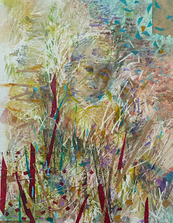
Whilst exploring some ideas about layering my work I thought about working 'landscapes' on top of portraits or figurative work. initially the characters were quite dominant in the work. My children found this a bit creepy! I felt that the work was a bit confusing and that instead of working together the images were fighting for dominance. When I decided to ignore the figures and concentrate on expressing the nature of the land things started to work more successfully.
                                                      'A bit Creepy'

f