Learning Log - Holy Land of the English-
 |
| Holy Land of the English |
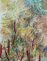
I decided to call this painting Holy Land of the English as this is another name for the Fens, derived from the unusually large number of cathedrals, abbeys and churches in the Fenland. I like the link with old English hymns such as Jerusalem and thoughts of crusaders. It is also a homage to the patriotism of the English (pink and white!) and a celebration of rural life. I think there are elements of the stained glass similarities with windows in the painting, the leadwork and the bright colours of the glass.
My final painting began life as 'A Bit Creepy', a study I had done earlier but wasn't very happy with. However, when I was looking through my sketch book -as I often do throughout a project- I realised that I really liked a small part of the study at the bottom left, and decided to base this painting on that. I felt that this area had all the vigour,form and excitement of the Fens really up close.

 I was enthusiastic about the idea of doing something very colourful and abstract. I felt this would demonstrate the joy of planting and growing, regeneration. After all spring has now arrived! This painting is really a celebration of what man and nature have achieved together.
Beneath the paint there are photocopies of a drawing of Lowin, an athletic young man scrambling onto the climbing frame. You can just see him in the middle right hand side of the painting. There are the intersecting lines of thread resembling railway and road and the long ditches that intersect the fields. There are the regular rectangular shapes of the fields and the printed stripes of the furrows.
To represent the interlocking blades of grass I cut up strips of paper with satellite images of the area. Small towns and villages like Sawtry, Yaxley and Ramesy and the old roman Eye Road are there to be found on close inspection.
It was quite a challenge to take such a small area and enlarge it so much. I was worried that the painting would not have much depth and that it would be impossible to replicate the textures and tones. The sketch is a watercolour, my final painting uses oils. I think I have been able to keep the basic composition fairly true, but have taken a liberty with the colour, making it bolder and brighter.
I was anxious to still keep the painting quite edgy and decided to introduce the Pebeo black sand in a more structured way. I masked off some areas then applied the sand, when this was dry I put a warm burnt sienna wash over it. I was pleased with the result of this. I think the sharp lines work well with the organic nature of the sand and bring an industrial feel to the painting.
I have printed some narrow black stripes on the canvas which I really like. They echo the rhythm and composition of the painting and a kind of 'order' to the 'chaos'. I like the fact that you can see through them and this brings a sense of depth, a feeling that something is beyond what we initially see.
A lot of fancy' papers have been used in the collage, including some shiny metallic and old gold paper. Normally I would avoid these, but I think the metallic glint is an appropriate reference: firstly to the industrial elements of the landscape and also as a nod to religious iconography.

0 Comments:
Post a Comment
Subscribe to Post Comments [Atom]
<< Home