Friday, 24 February 2012

Kurt Jackson at the Redfern Gallery


Kurt Jackson at the Redfern Gallery


This week I had the good fortune to visit Cork Street, London. At the Redfern Gallery Kurt Jackson was displaying his latest work, a series of sea and riverscapes from Dorset, Cornwall, Scilly and the Dordogne. The scale ranges from a modest 16 x18 cm to a whopping 196 x277. I was familiar with Jackson’s work but had never seen anything in ‘the flesh’ so was eagerly anticipating my visit.


The energy and vigour of these works is evident in the dynamic application of paint and texture. Jackson’s passion for the land and sea are evident in every stroke, flick and splodge. You may be forgiven for thinking this work is a series of happy accidents but this is viewing a master at the game of ‘control and chance’.
His smaller works, often on card or paper show delicate skill and sympathy with sparkling water and subtle colour. His larger works demonstrate a love of texture, drama and invention (I’m sure his vest was glued onto one canvas, along with shells, sand and goodness knows what else!).

Jackson’s use of colour is rich, inventive and utterly glorious. I left the exhibition desperate to get home, pull out my paints and start some splodging, splashing and flicking of my own.

Saturday, 4 February 2012

Learning Log P.4 Developing Fen Theme

Learning Log P.4 Developing Fen Theme


This series of paintings began with a lot of thinking about developing my previous work. It was important to me that I took these paintings a bit further in terms of concept, colour, texture and design.  I chose to work on a slightly larger scale as I enjoy working bigger and I would also be able to scale up detail within the previous studies.


I spent some time cutting up photocopies of the studies to help analyse the composition of the works and how I could home in on certain details. I then looked more closely at the segments and explored how these could be interpreted using a variety of media.
  I found using collage and mixed media very helpful as the various textures helped me to interpret the original work in a different way.


Although these are very small I think these are the most successful studies.


In all these works I have brought my studies of black to the ‘canvas’, usually starting with a black background, or introducing it fairly early. I felt that this brought a slightly mysterious and dramatic atmosphere to the work and gave me an opportunity to explore colour in a new way


Painting 1. Red Letter


This work began as a development from a small study. I was interested in the arrangement of horizontal and vertical lines – a theme that has dominated this series. This interest has come from the ploughed lines in juxtaposition with the growth of the grass, wheat, stubble etc. and the striated effect of distant flat fields.

Although this painting has strong horizontal and vertical lines they are of an organic nature, soft and flowing. Like much of my work there was a lot of sticking down and then pulling off, string, thread and various strips of paper, and of course sticking back down again!

I did this work on Dalerboard, which contributed to the overall softness of the finished work by providing an semi absorbent base. This made it easy to adhere things to but harder to paint on as it didn’t have the rigidity that I like when my board is on the easel.


I really enjoyed working the textures and colours in this painting and feel that there is a nice quality of light coming through from the horizontals down into the verticals. I find the change of scale between the foreground stalks and those in the distance quite satisfying as they add to the sense of depth within the work.


I have called the work Red Letter because the three dominant letters in the work are I.O.U. This is a reference to the economic times we are in and red relating to the light on the horizon. IOU is also a comment on the debt that we owe the land, the source of our daily ‘bread’. This is truer in the agricultural fens than in some parts of the British Isles.


Painting 2. Barcode


This painting was a direct response to Red Letter; a way of turning the perspective of the landscape into some thing more structured. Row upon row of harvested crops leave their stubble behind. The repetitive geometry of the landscape demonstrates man’s mastery of the land but the irregular pattern within the stalks and soil demonstrate nature’s persistence and irrepressibility.
The binary nature of positive and negative stripes in the field references the bar codes that we use to purchase our goods today. This painting reminds us that the price we pay is not simply monetary.

The plain, unadorned sky is intended to be a foil for the densely patterned land and as a reinforcement of the positive and negative elements in this painting. The white horizontal stripe acts as a point of illumination. I think that perhaps this painting could have simply been a black and white barcode, but I like the soft greens alluding to the stirrings of growth and the visceral red symbolising the blood of the earth. The blues represents water - the essential element for all life.

This painting began with strips of soft tissue overlaid with strips of local news paper. The tissue has been allowed to rub away in certain areas to expose the board or to gather in little strands. Most of the white stripes have been executed using white photocopy paper. This was to create an intensity of light and a random cut or shorn appearance. White threads added scale and soft tones of blue, green and purple were introduced to add colour and depth.


Painting 3. All Cut Up


This is in essence a rework of a previous painting, Last Light. I looked closely at how I could focus more acutely on the texture and rhythm of the field. I began by layering horizontal strips of tissue over thread diagonals. I introduced some horizontal threads onto the ‘sky’. These would create the basis of the composition of the painting. The work was then built up with layers of simple shapes: torn or cut paper and newsprint of various sizes and layers of colour washes added on top.

Within the painting are pictures of local people cut from the newspaper. Some have been treated with a wash and/or outlined. I like the concept of including people who inhabit the area. The development of the land has been to provide these people with jobs and sustenance. It is good to see them looking healthy and happy, as one day they will return to the land in a very literal way to continue the cycle of life. It is appropriate to use a lot of black in the execution of the fen soil; it is so dark and rich. Black is an infinite colour receding forever. This is another reference to the timeless quality of the land. Some sand and local dirt was added in the final stages to add texture to the foreground. White ‘stitching’ was added to highlight the rhythm and structure of the field.


Painting 4. Tangled Web


The concept behind this painting was to explore the structure that faces you, up front and in your face when you bring yourself down to the level of the land. The field becomes a solid mass, yet it is created one stalk at a time. It is the repetition of each stalk over and over again that creates the mass. At the fringes of the field these stalks become tangled and separate from the main body.  They are subject to weather, weeds, and tramping feet. This painting simply shows the difficulty for those around the perimeter, untended, unused and becoming ever more entangled with each other.


This painting began as a ‘recycled’ board, which had a thin black wash all over. Strips of brown paper towel were added to create the ‘web’ and a process of layering colour and structure began. The light areas were created by printing from a paper towel as I wanted a fairly solid shape but with a softer texture. The diagonal turquoise lines add drama and visual structure to the painting. They are fractured light and pull everything in to a central point. The stitch lines are again a way of highlighting certain areas and a reference to the applied nature of the painting.


5. Last Stand


I keep being drawn to the geometric patterns within the fields. The abandoned stubble, shorn and left to rot. In time it will be ploughed back into the earth. Until then the elements and animals can do with it as they please as it makes it’s last stand.

After painting so much black I felt in need of a little ‘light’ relief (ha ha). I started with a white undercoat and then the painting was created with the use of strips of newspaper and paper towel. Horizontal juxtaposed against vertical. Within those shapes a pattern of diagonal shadows and highlights were created and soft earthy hues introduced. The thin white lines that dissect the painting represent refracted light, draw your eye around the painting and echo the geometric shapes within the verticals. Although there is much in these paintings that seems random or by chance, these geometric structures allude to the laws of science that all nature must adhere to.


Painting 6. Inside Out, Inside In

In this series of fen fields we have always been outside looking in. In this painting we see the view from within the field’s interior. This painting has a lot of ambiguity. It is difficult to see exactly where some of the stems begin or end, the season, the weather or even the time of day. We can just about see the barred gate in the background, but are we in or out of the field? The black area leading in from the right seems to indicate a slightly sinister presence. Is this fertilisers, genetically modified crops, the impending scythe of the harvest?

I had recently seen Gerhart Richter’s retrospective exhibition and can see some of his influence in this painting – the colourless blurred grey at the top of the painting, bright colour and images that are revealed and yet not revealed

Once again I have used a previous painting. This was a fen view done a few years ago. I had been looking at the complimentary combination of blue sky and orange fields. The painting was cut to size and I began to add strips of heavily textured paper. Most of these initial strips have been pulled away as they were too dominant in the work. All that remains are a few bits of the backing paper and some negative shapes. These have been worked into with black and some colour. Some of the stalks have printing on them and others have had colour bled onto them. A very pale soft grey was smudged into a skyline, just catching the tips of the stalks. This seems to intensify the colours and create a wistful distance.


Gerhard Richter - Panorama Review


Gerhard Richter - Panorama

Tate Modern


December 2011


I went to this exhibition full of anticipation. A friend had raved about it and everything I had read seemed to indicate that this was to be an exceptional experience. However this is not an ‘easy’ exhibition. It is challenging on many levels. It is huge, 17 rooms, and work that spans 5 decades. The content ranges from the intimate family portraits and floral still-lifes, to the terrors of Natzi Germany and 9/11. He is trying to deal with destruction, terror, oppression, repression and inhumanity.


Richter is without doubt a considerable force, an artist of great intelligence and technique. His work shows a constant exploration of paint and it’s properties, his skill is never in question, but I found the continual  punctuation of photo- realism a kind of continual reminder that he has mastered traditional techniques, and wants you to know it. I am sure that Richter is not so vain but for me these paintings were distracting from his obvious interest in the abstract.


I felt that Richter’s german character was strongly prevalent, there is always something formal in his work, and a certain detachment (perhaps this just a lack of Romanticism which we Scots seem to value in our paintings). This is probably due in some part to the use of photographs (shockiing!!). The predominant use of monotone and the blurring distances the viewer, and by default, I think the artist from the subject matter. Richter paints the picture, but the comments are entirely your own. He tells the story like a reporter. Perhaps this is his strength, because he is detached we can fill in the human elements/emotions. Our reactions can be uniquely ours.


I loved his exploration of monotone abstractions in the ’60‘s. Photographs could never do justice to the subtlety of their texture and tone but it makes you wonder how much influence the war and his early upbringing in East Germany had on Richter. Room after room of monotone and grey becomes oppressive. Even the landscapes, great seas, and fluffy clouds are always shadowed and overcast. In all of his early work I was looking for a symbol of hope, some ‘light.


When he turns to colour in a series of abstractions the colour is a brash and acidic violence. They are overwhelming, brutal and disturbing, as though this adventure into colour was a violent reaction to the soft, blurred monotones of his earlier
work.


I loved his exploration of monotone abstractions in the ’60’s  and 70‘s. Here he is confident, energetic, vibrant, even without colour. We can see influences of Rothco and Pollock, but they are pure Richter.


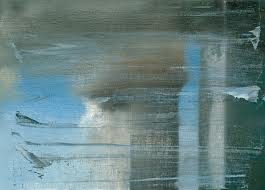
 In Richter’s later work  -Cage, September 11, Sinbad paintings done with an industrial squeegee, there seems to be more subtlety and light. Finally Gerhard and I were on the same page. The tones were softer and the ambience gentler, even though September 11 is a painting of a catastrophic event of terrorism you are given the beautiful soft blue of the sky. This highlights the awfulness of the event; when things can be beautiful and yet shocking. When we look at the monotone Baader Meinhof paintings we are distanced from them, not only by time, but by the blurring, the lack of colour, and the seemingly cold reportage approach.


I have to ask myself why are these paintings so huge, throughout the exhibition the scale becomes bigger and bigger. If you are going to use a large, and I mean massive, canvases then surely there has to be some justification for that choice. Is using ever larger canvases part of growing older, when your own mortality looms ever closer, is making your own ‘mark’ larger, life affirming?  Are we invited to get lost in the sensation, the colour, the blur? I cannot believe it simply a case of “because I can”. Perhaps as Richter himself says “it is to create something incomprehensible”.

It seems somewhat ironic that I adore Richter’s paintings when I see them photographed. The compression seems to enliven and enrich them. Details are glorious. I don’t know why, but I do prefer the photos, of paintings of photos! Am I glad I went? A resounding yes”. Was it challenging? Oh yes! Did I learn anything? Yes, Yes, Yes!


Alisdair Grey at GOMA


It was an interesting experience viewing the work of Alisdair Grey. His work is dominated by strong graphic images illustrating fantastic and fanciful themes carefully constructed.
 Grey was born in Glasgow in 1934, studied at Glasgow School of Art, and has pretty much lived there ever since. the city has had a profound effect on him and is the subject of much of his work. In the 60’s he worked as artist in residence for the People’s Palace recording Glasgow and it’s people.


There is an air of detachment throughout all Grey’s work. He is very much the voyeur, standing outside of the drama. He seems more interested in the setting than the figures. Within much of his work there are self portraits. These portraits show a lean, carefully detailed character, when other figures are often simple line drawings Infact, Grey is often the most detailed figure in his work, is this a sign of his self obsession or just a lack of interest in everyone else? Interestingly his studies of Glasgow demonstrate meticulous attention, are lovingly observed and drawn with great sympathy.

His portraits have a strong two dimensional quality, using areas of flat colour. The pencil marks left to show through any colour. I find it intriguing that often only parts of his work are coloured; this adds emphasis to some areas, and perhaps suggests that we are all works ‘in progress’.

Some of his work contains significant areas of text. This may be a refrence to his literary interests, but I seem to find it distracts from the primary image. I enjoy some caligraphy in work, especially where it adds texture and some simple refrence. Grey’s text seems to be  there to support or add to the picture. However you have to ask yourself if visual art shouldn’t be able to ‘stand alone’ and that the musings of the artist should be accessed in some other way.


Grey obviously loves architecture, and especially the architecture of Glasgow. Having been a student in Glasgow in the 80’s I was particularly drawn to his large pencil drawings of familiar scenes. He likes to draw places where the roads meet, where old meets new(then!), young meets old. All in all this was a stimulating exhibition, helping me to question my own involvement with my direct environment and the figures within it, and how I give priority to certain elements within my work.